I began with paper. I crumpled up the paper in differnt ways, experimenting with tearing and stressing the paper. After the paper was in a crumpled form I would draw it. From that i found the shapes interesting and began to brainstorm ideas on how to make it into the skeleton skin project.
I used wire, plastic wrap, and spray glitter in creating the form. I used the spray glitter on the edges for depth and to catch light.
Thursday, February 27, 2014
Transformation Artist Statement 02/27/14
My first thought with this project is that I wanted to choose the option of making something
using a lot of the same item. I knew I had a lot of crayons and that I wanted to use them. The more I
thought about the project the more it seemed like a giant tease. The goal was to basically make
something that you can normally use, and make it so you can’t use it anymore. So my thought process
with these crayons was to make it so they were no longer usable. Then the second thought was that
crayons are normally used by children, so I chose to hang them so a child could not reach it, therefor
they are completely void of their normal use. The project is basically a creative game of keep away.
Trevor Paglen (Extra Credit) 02/27/14
Throughout most of the lecture that Trevor Paglen gave he talked a lot about secret government projects. One thing I distinctly remember were the patched that he showed us and how they were there to signify who was part of the secret project. It was odd how they couldn't talk about such projects but were given patches that had hidden meaning on them as to what the project was about.
Another topic that he discuss was the secret satellites that he would photograph. there is this whole group of astronomers that basically just track these satellites. He began to do the same and then would photograph them in the sky as the passed by in orbit. With these satellites, he discussed how they basically become space junk after sometime in space, they don't deteriorate because of the conditions, but they would eventually stop working, exit their orbit and just remain where they stay if not float off into space of come falling back to earth.
From the talk about eh satellites he began to talk about a project that he did in which they sent a sort of artwork/message up in space for the future generations. He did this because he thought about all the artwork there is no w that has our own interpretation to it but no actual documentation from the time stating the true meaning. So he wanted to send a message to the future basically with a clear meaning.
Those are the topics that stood out most to me in listening to his lecture.
Nina Katchadourian 02/13/14

Nina Katchadouraian is a multimedia artist working in photography, sculpture, and video. I first found out about her last year in another class and was then reminded about her in a recent class lecture. the first a saw of her was the first photographs of herself in an airplane lavatory and she had dressed herself with toilet paper. I thought that the act of that alone was interesting.
A lot of her work that I've seen I'm not really too fond of I think just because I find it to be little too simple. I really enjoy her spiderweb photographs. I find it interesting that she was intentionally helping something that other's try to kill, she helped the spiders in an odd way but it's the thought that counts.
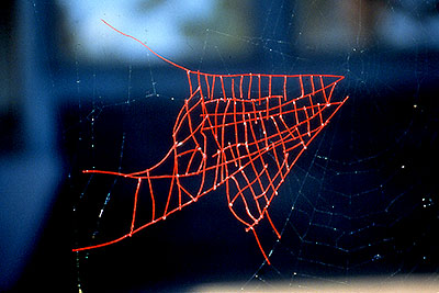 I find these works to be the most interesting of what I have found of her. She just did something so odd and out there, that in reality doesn't help spiders at all, but more or less fixed something created by the spider to it's almost original glory.
Nina Katchadourian
1998
Mended Spiderweb #8 (Fish Shaped Patch)
20"x20"
 With these works I really just enjoy them because they're funny. You never really think about the book titles as a whole only as individuals. It's odd that the colors go fairly well together, they're all forest-like tones, nothing too bright or anything that would have an off setting juxtaposition.
Source:
-Nina Katchadourian. Web. www.ninakatchadourian.com/index.php.
Tara Donovan 02/13/14
 We discussed Tara Donovan in class, which is how I found out about her. In reading article about her, it talked about how she came into her latest work. The article explained how it was studio mishap that started it all. A large box of toothpicks spilled, and the way in which they landed caught her attention. This mishap is how she came to create her toothpick cube. Whether this story is true or not I found it very interesting. In her work she uses mass produced materials and just begins to create. A lot of the work she does is site specific.
I like that she has no deep inner meaning about the work that she creates, she chooses her material because she likes the look of it and she just goes. I feel like not enough artists do this and it's always about the meaning of the work that is the important thing rather than the work itself.
 This is the work that i first discuss, "the studio mishap". I find it very impressive that it's so perfectly square. There is something almost disturbing about how perfect it is. Its so simple and I think that's what makes it effective.
Toothpicks
2001
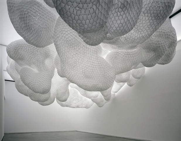 This is my favorite work from Tara Donovan. She has completely transformed her material, cups, into something completely new. It is very recognizable as cups, and the way that it works with the lights just gives it a whole new life. The form looks almost light a weird liquid material to me.
Source:
-Hudson, S. (2009, 01). Tara Donovan. Artforum International. 47, 204. Retrieved from: http://search.proquest.com/docview/214332731?accountid=9649.
-https://blogger.googleusercontent.com/img/b/R29vZ2xl/AVvXsEjSOCRVk-vNWAlFb-P7ljMzphL72CVFPPWaf4kSlMYFCdEMetqYL__CIo5O3NLD6w6j5kQ5AtqCQRXFubNBhXFJvIfRoNT29V6MV3YL7wpFSEBr29gX2gMt2sS-5Zlg724rqKfc0I3mEHSe/s200/10donovan-muhlke-custom4.jpg
http://designobserver.com/images/features/tara_donovan_9.jpg
-http://lh4.ggpht.com/-qHIZAqboAs4/TiBGQSSuC1I/AAAAAAAAFj4/4Cu4J1hvm_U/tara%252520donovan%2525201.jpg?imgmax=800
Su Blackwell 02/13/14
 Su Blackwell is an artist out of London who's main media is paper and textiles. Her paper art is also used with her book art. She often transforms or illustrates the contents of the book in her work. She gets a lot of inspiration from fairy tales and often uses them as subject matter in her art.
In reading about her I found that she reads the books before transforming them, and in so doing uses the books to inspire her work. Being a book lover i find this to be an interesting concept. Somethings interesting i find about her work is the look of it. It all looks so delicate but it's also very sturdy and strong looking, like if i touched it it wouldn't bend or crinkle. She also varies from very very small works to larger than life size which I like because I think it would be too easy to stay in one size.

This is the work that I found when first discovering her. I like the ghost-like quality that the piece portray, but still a very light and whimsical feel to it. I also like the fact that their are butterflies on the ground, it makes the piece unique and gives the work a nice balance.

I'm not sure which work this one comes from, but i had to show the amazing close up of the detail that she puts into her book works.
Source:
=Su Blackwell. Web. www.sublackwell.co.uk/profile.13 Jan 2014
-http://ww1.prweb.com/prfiles/2010/12/06/4870524/0_1025LondonSB44.jpg
-https://blogger.googleusercontent.com/img/b/R29vZ2xl/AVvXsEjrWhhmneO7Z09SyCnI5SOPFwhl7ShkUGjH6zjnnlXVZsNa_-orc0ZF3Jt6RS-gZn0FrJVRvLbzbczHC0R5KXegS0QUW3cORQK8hxdoMLvFZgwm4Cxpfz0Irfir8922QoOwExj4vw22FeyP/s320/2004-while-you-were-sleeping.jpg
-http://thestarbook.files.wordpress.com/2013/02/2011_baron_detail_3-su-blackwell.jpg
Alberto Seveso 02/04/14
Alberto Seveso started as, or was recognized, as a graphic artist in the 1990's. His initial inspiration came from skateboards and CD covers. He basically wanted to create things that he saw. His work is based out of Italy. In his portraits, they start out as photographs and then he edits them in creating his artwork. A lot of the portraits seem to disappear and transform into something else. He did a series of water and ink photograph, which is what i most know him for.
I like the boldness with the colors and forms that he uses in his work. Everything just grabs your attention. I like his water and ink photography more then some of this other work. I've seen a couple people both professional and in school try to copy some of his work and it doesn't even begin to look similar.

This is one of his works that I discovered in doing my research on him. I found his line work to be so intricate and detailed. So many of the lines seem unnecessary but they still work really well in the portrait.
 This is one of the works that drew me to him as an artist in the first place. I'm curious as to what he is using to get the color. Regular ink is translucent when put into water, so I'm wondering if he used milk or some other opaque material to make color behave in the same way.
Source:
-Alberto Seveso. (Web) burdu976.com/?page_id=16. 4 Feb 2014.
-http://vectorpatterns.co.uk/wp-content/uploads/2011/05/womensoviener.jpg
-http://wearesodroee.files.wordpress.com/2012/10/alberto-seveso-4.jpg
I like the boldness with the colors and forms that he uses in his work. Everything just grabs your attention. I like his water and ink photography more then some of this other work. I've seen a couple people both professional and in school try to copy some of his work and it doesn't even begin to look similar.
This is one of his works that I discovered in doing my research on him. I found his line work to be so intricate and detailed. So many of the lines seem unnecessary but they still work really well in the portrait.
This is one of the works that drew me to him as an artist in the first place. I'm curious as to what he is using to get the color. Regular ink is translucent when put into water, so I'm wondering if he used milk or some other opaque material to make color behave in the same way.Source:
-Alberto Seveso. (Web) burdu976.com/?page_id=16. 4 Feb 2014.
-http://vectorpatterns.co.uk/wp-content/uploads/2011/05/womensoviener.jpg
-http://wearesodroee.files.wordpress.com/2012/10/alberto-seveso-4.jpg
Judith Braun 02/06/14
 Judith Braun started out in the 1980's as a figure painter. she was Painting figures in a realistic manner. She painted naturalistic scenes, but then she state painting angles in a more dream-like world. After her period of angels she began to finger paint. She used graphite and her hands to create large compositions. Most of the works is symmetrical designs and landscapes.
What i like about her is she is showing up all of the elementary kids out there who are finger painting as we speak. I remember finger painting and it was nothing even close to what she does. On top of this she uses graphite, most smudges with graphite in my drawings are accidents, she is making the accidents a purposeful thing. It seems like it would have taken a long time to really get the technique of know how much graphite to use and how much pressure to apply with yours hands.
 I think this work is pretty darn awesome, she basically has a wall of her own finger prints. I'm so curious as to whether she lays it out before hand or if she just lets herself loose on the wall/canvas.
 I am basically just aw-struck by these works. It's hard enough to create symmetry on your own but to do it like this and in such an impressive way is just amazing. There is a great range of values. she also does some other work where I think she uses color pencil on black paper.
Source:
-Judith Braun. Bio. (Web). judithbraun.com/46225/bio/ 4 Feb 2014.
-http://abominableink.files.wordpress.com/2013/01/e-judith-braun.jpg
-http://www.odditycentral.com/wp-content/uploads/2012/03/fingerprint-painting-550x424.jpg
-http://asset1.itsnicethat.com/system/files/042012/4f880fbd5c3e3c55d4002656/img_col_main/Jude.png?1354581340
Diana Al-Hadid 02/04/14
 Diana Al-Hadid is a sculptor from the middle easy. She makes large scale installations and sculptures using a varity of materials. Her work would be considered as folkloric, and influenced by European architecture. A lot of work has influences from her childhood and upbringing. Some of her work has very simple materials such as paper cups, while others are a lot more intricate using metal works and other various materials. She began to torch a lot of her work in the process of making them in order to avoid it looking too polished.
Part of the reason why I like her work is the European architecture inspiration. I really like that look of the old cathedrals and things like that. She takes these influences and uses her knowledge of them to create her own building out of it (a much smaller scaled building though). The work has such a dark fantasy feel about it. The whole work seems sinister, and yet there is nothing really frightening about it. She also adds a lot of personal details to her work. These include little feet that she has in a lot of her work. She puts a lot of personal touches in that no one would really notice unless they were looking for it. It seems like she uses her work to make sense of things in her own life.
 I wanted to show this work because i wanted to kind of show the evolution of her work. I'm not a big fan of this work just because it seems all over the place to me. I also think this work pales in comparison to her other sculptures.
 This is one of my favorite works that she has done. It's a pipe organ. I just love the form and the weird essence of the piece, it's a very creepy and twisted looking organ. It seems like it would take so much time and skill to make something like this, not to mention the knowledge of organs she probably gained in making this.
Diana Al-Hadid A Measure of Ariadne's Love-2007
Wood, aluminum, fiberglass, polystyrene, resin, cardboard, plaster, paint, and plexiglass
299 x 213 x 243 cm/ 117.6 x 84 x 96 in.
Source:
-Stillman, N.2008,12. Diana Al-Hadid. Artforum International.47, 303-304. Retrieved from http://search. proquest.com/docview/214336044?accountid=9649.
Artist Talk: Diana Al-Hadid. (Web). www.artbabble.org/video/hamnier/artist-talk-diana-al-hadid. 4 Jan 2014.
-http://dailyserving.com/wp-content/uploads/art/Diana-Al-Hadid-12-18-06.jpg
-http://www.galeriemichaeljanssen.de/tl_files/media/images/artists/diana-al-hadid/DAH-0001.jpg
Peter Gentenaar 01/30/14
Peter Gentenaar is a Dutch artist who creates 3D paper sculptures. He started as a print maker but then started getting frustrated with the paper he was using so he decided to start making his own. His works are created by reinforcing the paper with bamboo and then allowing the paper to dry and shrink at the same time. He is inspired by the material itself and allows the material to shape his work.
I enjoy his work because of the organic, free-flowing feel that the shape and forms embody.Though what I'm curious about is how much of it, at least when he started out, was intentional. In working with the material so much now does he just now what the paper will do, or is it part of the work to let the paper just do it's thing and become the work on it's own? If it is all planned out, how long did it take to understand the material and how it would work the way in which it does?
 I also don't have a title for this one. I know that his works are normally on a larger scale. This work just seems to intricate, like it's almost a drawing with all of the lines that you can see in it.With the different values of color it just seems to create it's own depth just in the line and color.
 No title again. For the most part I think a lot of his works look similar. They are all in that same flowing shape with some color variation. So I don't have a specific case as to why I like this work specifically. I personally just like the fact that it's displaying in a cathedral/church. It seems like the work is put in high esteem to be put in such a place.
Source:
-Gentenaar, Peter. "Paper Objects". Web: www.gentenaar-torlet.nl/index.php/peter-gentenaar. 30 Jan. 2014.
-https://encrypted-tbn2.gstatic.com/images?q=tbn:ANd9GcRY-qT3iotMgyzs1_QnSQ7FlZqRJQC-mSv7oujaB-gaaXcw4tXbgQ
-http://media-cache-ak0.pinimg.com/236x/1a/33/fe/1a33fee63c43d7cf5cf0a1712970c4f2.jpg
I enjoy his work because of the organic, free-flowing feel that the shape and forms embody.Though what I'm curious about is how much of it, at least when he started out, was intentional. In working with the material so much now does he just now what the paper will do, or is it part of the work to let the paper just do it's thing and become the work on it's own? If it is all planned out, how long did it take to understand the material and how it would work the way in which it does?
 I also don't have a title for this one. I know that his works are normally on a larger scale. This work just seems to intricate, like it's almost a drawing with all of the lines that you can see in it.With the different values of color it just seems to create it's own depth just in the line and color.No title again. For the most part I think a lot of his works look similar. They are all in that same flowing shape with some color variation. So I don't have a specific case as to why I like this work specifically. I personally just like the fact that it's displaying in a cathedral/church. It seems like the work is put in high esteem to be put in such a place.
Source:
-Gentenaar, Peter. "Paper Objects". Web: www.gentenaar-torlet.nl/index.php/peter-gentenaar. 30 Jan. 2014.
-https://encrypted-tbn2.gstatic.com/images?q=tbn:ANd9GcRY-qT3iotMgyzs1_QnSQ7FlZqRJQC-mSv7oujaB-gaaXcw4tXbgQ
-http://media-cache-ak0.pinimg.com/236x/1a/33/fe/1a33fee63c43d7cf5cf0a1712970c4f2.jpg
Andy Goldsworthy 01/30/14
I personally love Andy Goldsworthy's work. I believe it take incredible patience and commitment to create the things that he creates.
He has amazing symmetry just using sticks and stones. I think I like it most of all because I find it very impressive.
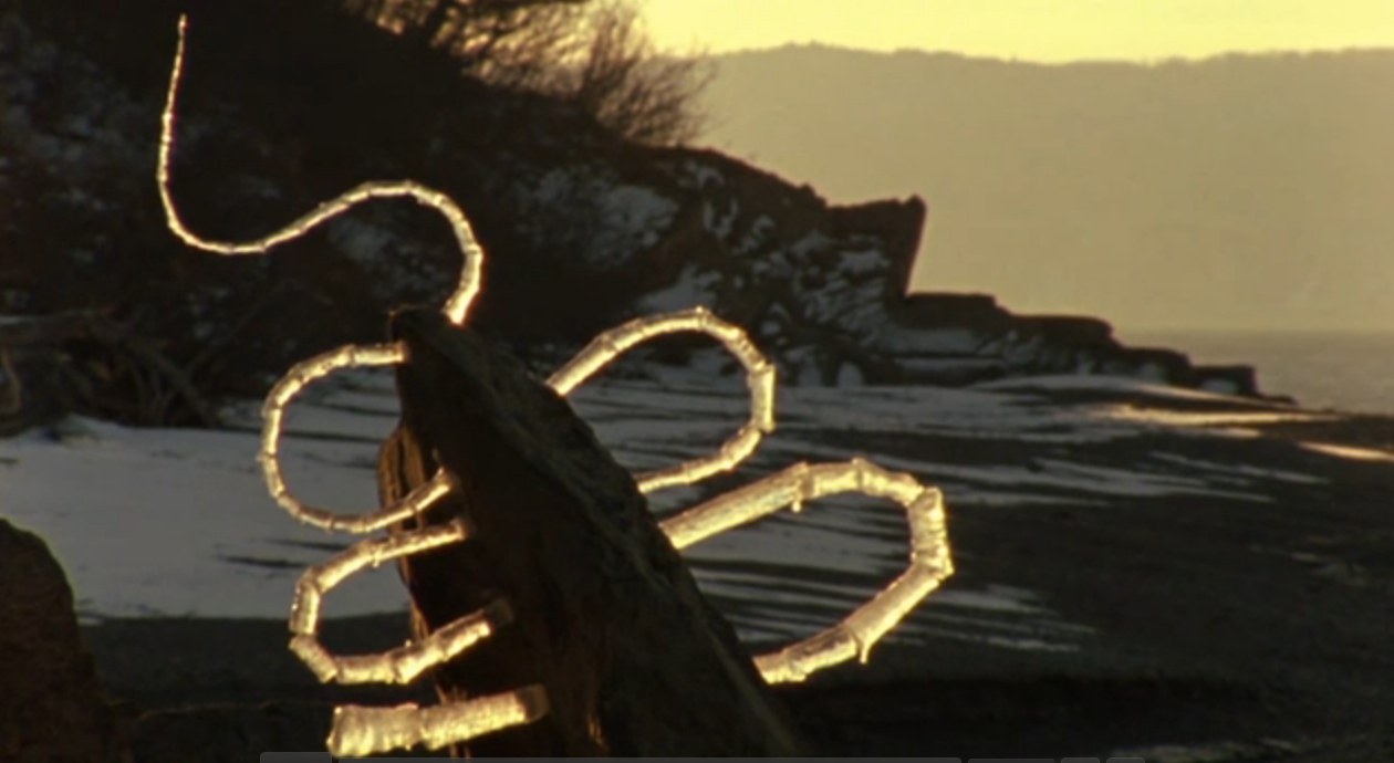 This is one of my favorite works that he has done. I don't have the title for it. I first saw this when i saw a clip of his documentary Rivers and Tides. He found a large stone and attached icicles that he found to it using water to attach the pieces and his teeth to shape the icicles.
 I also don't have a title for this one. This one i mostly like because I really want to know how he did it. There are no footprints or anything but it looks to be ice covered in snow with the curvy line drawn into it. I just want to know how he does all of these things so perfect.
Source:
-Lubow A. " Andy Goldsworthy" Smithsonian 36.8 (2005) 46-47. Academic Search Premiere. Web. 30 Jan 2014.
- http://1.bp.blogspot.com/-m0Naer9RZYo/T0VQd09m1EI/AAAAAAAABOQ/hW60GGL5uko/s1600/andy-goldsworthy-avatar-1468.jpg
-http://iranzuguijarroplaza.files.wordpress.com/2012/05/captura-de-pantalla-2012-05-13-a-las-11-34-08.png
-http://www.artificial-eye.com/database/dvd/ART314DVD/images/01.jpg
Subscribe to:
Posts (Atom)