Tuesday, May 6, 2014
Muybridge Artist Statement
In this project I really wanted to stay true to the images that I saw of Eadweard Muybridges work. I wanted to do a sequence of images that depict movement. I wanted to take a more contemporary approach to the work and choose a different subject matter that would have a more interesting movement. I decided that I would show the movement of two liquids interacting together. I started with a large pitcher of water. I mixed food coloring and milk together and slowly dripped the mixture into the water. I took black and white photos of the process and posted them together in sequence. I wanted the pictures to be in black and white so that the color wouldn't be any sort of focus and that the movement would shine through in the photos.
Joseph Vassie
Joseph Vassie is a artist working various areas of drawing and painting. I couldn't find much information about his background and lifestyle.
I like specifically his circular pen drawings. He has portraits and body parts in which he depicts in a pen drawing.

 Most of the work of his that I liked was all pretty similar and I'm guessig part of the same series. I like that he draws such a simple subject matter in a very intricate and interesting way. it seems almost careless in the way that it looks but I'm guessing its all very intentional and precise in its creation. I also like that he didn't use much color and just brown and black. I feel like its complex enough that color would detract from the delicate lines.

Source:
http://cdnpix.com/show/imgs/93fb50e91ef8e39eae25e5452d19502d.jpg
http://d3oeu2l8qd7s1b.cloudfront.net/311259/art/461584/247220-7.jpg
I like specifically his circular pen drawings. He has portraits and body parts in which he depicts in a pen drawing.
Most of the work of his that I liked was all pretty similar and I'm guessig part of the same series. I like that he draws such a simple subject matter in a very intricate and interesting way. it seems almost careless in the way that it looks but I'm guessing its all very intentional and precise in its creation. I also like that he didn't use much color and just brown and black. I feel like its complex enough that color would detract from the delicate lines.Source:
http://cdnpix.com/show/imgs/93fb50e91ef8e39eae25e5452d19502d.jpg
http://d3oeu2l8qd7s1b.cloudfront.net/311259/art/461584/247220-7.jpg
Kwangho Shin
Kwangho Shin is a drawer and painter based out of Seoul. He studied at Keimyung University. His work is mostly distorted portraiture. His main tools are charcoal and oil paint.
as I've written before, I really enjoy portraits. I like these in particular because of their distortion. I feel like each of the paintings has their own individual feeling to them in the way that they are distorted.
 Most of the work of his that I've seen has a lot of color in it. I like that this one is different and is in a more monotone color scale. I like that they details in the face aren't too distorted. It's mostly the outer edges that have gained the big distortions. Its also nice how the highlights and shadows are in their proper place on the face despite the distortion.
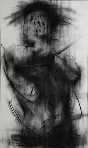 This is the drawing in which I first noticed the artist. When i first looked at it I couldn't tell that it was a person. Then after realizing it was a person, I couldn't tell what they were doing. Now after distinguishing the hands I understand the figure. I like that the gesture is complimented by the black smears, it almost mimics the action of the figure.
Source:
http://en.wikipedia.org/wiki/Shin_Kwangho
https://d1ycxz9plii3tb.cloudfront.net/additional_images/5321f08dcb4c278738000040/medium.jpg
https://encrypted-tbn1.gstatic.com/images?q=tbn:ANd9GcSzVCzJni-Q69_uKfCxVlk2nSle2eKUOxsKdANF5QUQS1i05EgpEg
as I've written before, I really enjoy portraits. I like these in particular because of their distortion. I feel like each of the paintings has their own individual feeling to them in the way that they are distorted.
Most of the work of his that I've seen has a lot of color in it. I like that this one is different and is in a more monotone color scale. I like that they details in the face aren't too distorted. It's mostly the outer edges that have gained the big distortions. Its also nice how the highlights and shadows are in their proper place on the face despite the distortion.Source:
http://en.wikipedia.org/wiki/Shin_Kwangho
https://d1ycxz9plii3tb.cloudfront.net/additional_images/5321f08dcb4c278738000040/medium.jpg
https://encrypted-tbn1.gstatic.com/images?q=tbn:ANd9GcSzVCzJni-Q69_uKfCxVlk2nSle2eKUOxsKdANF5QUQS1i05EgpEg
Maurice Sapiro
Maurice Sapiro is New Jersey born artist based out of Connecticut. He is an oil painter mainly focusing on still life, landscape, and dreamlike landscapes. He's published books and won various awards for his work.
I like his work because it feels very traditional and calm to me. There is just a very airy feel to the paintings and reminds me of the older traditional styles of painting that I've learned about since beginning my art studies. I feel like traditional painting styles like this are going out of style and are being replace by a more modern and contemporary way of painting.
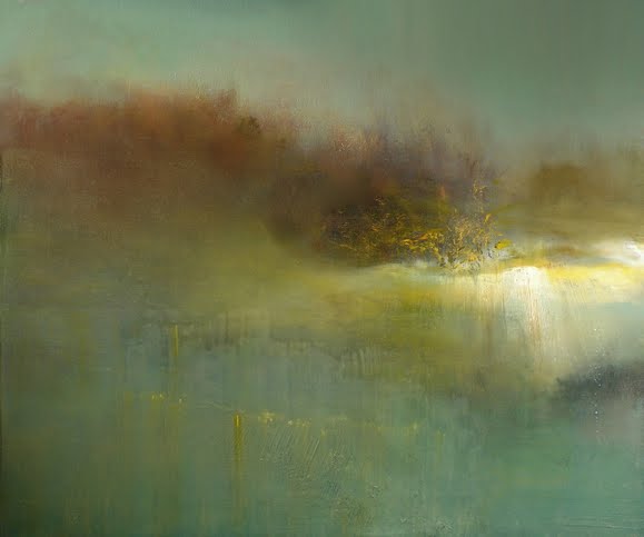 I love the use of color and texture in the painting. I feel like the balance is really nice with the heave light on one side and the various colors and drippings on the other. I'm curious as to how he got that look and texture to the clouds and sky. I think the use of yellow throughout the sky is also very effective.
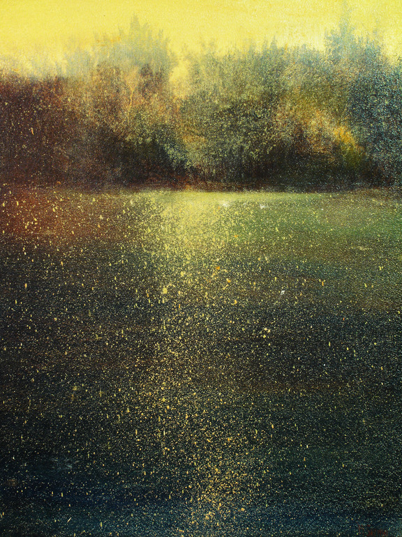 What I like most about this is the speckles throughout the dark areas of the piece. I'm' curious if he used a splatter method to do that or some other way of doing that other than by hand . I like the piece as a whole, but the area at the top by the yellow sky I don't like as much. I feel like it looks translucent against that background or maybe in just how it was painted. I just feel like its almost disconnected or unfinished in comparison to the rest of the painting.
Source:
http://mauricesapiro.com/bio/
https://d30dcznuokq8w8.cloudfront.net/thumbnails/w/580/h/483/q/85/product/5/3/d8839991c210ca55f5488f8fa7747f.jpg
http://www.slowartday.com/wordpress/wp-content/uploads/2013/02/1.jpg
I like his work because it feels very traditional and calm to me. There is just a very airy feel to the paintings and reminds me of the older traditional styles of painting that I've learned about since beginning my art studies. I feel like traditional painting styles like this are going out of style and are being replace by a more modern and contemporary way of painting.
I love the use of color and texture in the painting. I feel like the balance is really nice with the heave light on one side and the various colors and drippings on the other. I'm curious as to how he got that look and texture to the clouds and sky. I think the use of yellow throughout the sky is also very effective.What I like most about this is the speckles throughout the dark areas of the piece. I'm' curious if he used a splatter method to do that or some other way of doing that other than by hand . I like the piece as a whole, but the area at the top by the yellow sky I don't like as much. I feel like it looks translucent against that background or maybe in just how it was painted. I just feel like its almost disconnected or unfinished in comparison to the rest of the painting.Source:
http://mauricesapiro.com/bio/
https://d30dcznuokq8w8.cloudfront.net/thumbnails/w/580/h/483/q/85/product/5/3/d8839991c210ca55f5488f8fa7747f.jpg
http://www.slowartday.com/wordpress/wp-content/uploads/2013/02/1.jpg
Alexandre Farto (Vhils)
Alexandre Farto (also know as Vhils) is a Portuguese street artist. He studied at the University of Arts in London. Growing up in Portugal, wars in Portugal were going on and they later effect and influenced his work. He was first noticed and compared to street artist Banksy, and was soon after published and offered space for his work.
I like that his street art is more individual than a lot that I've sen before and it steps away from painting. Vhils style is based on carving a relief from and existing structure by digging and drilling through layers of walls. I also like that his work is both in the streets for the world to see as well as in galleries. I feel like it steps outside of borderline vandalism into art.
 Another things I really like about Vhils is that he doesn't need to use a lot of color and extreme contrast to make his work noticeable and beautiful. Its impressive that he finds so much detail when carving and drilling into the walls. I'm curious if he's run into problems with the walls and materials he uses, like the wall breaking apart more than he expected or if he has a knowledge of which walls he will be able to use or not.
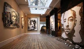 These are pieces that are shown a gallery space. It looks like he might have taken that chunk of wall and just put it up in the gallery, which I think is pretty cool in itself. It's interesting how there are chunks of wall, plaster, and rubble on the floor beneath a lot of the works. I like that it almost puts itself in it's own world by having the rubble below.
Source:
http://www.streetartbio.com/#!vhils/ci1d
https://encrypted-tbn0.gstatic.com/images?q=tbn:ANd9GcTUvHkGRSEkVj6e9V3smIhsAHPHqyExev-5SRyLqvaj2UJm4-vI
https://encrypted-tbn1.gstatic.com/images?q=tbn:ANd9GcTSmwhU2nZZwzzVuSiWi2XxGOFnmfgLhuuRmPggJi0cRh9RFJHFzQ
I like that his street art is more individual than a lot that I've sen before and it steps away from painting. Vhils style is based on carving a relief from and existing structure by digging and drilling through layers of walls. I also like that his work is both in the streets for the world to see as well as in galleries. I feel like it steps outside of borderline vandalism into art.
Source:
http://www.streetartbio.com/#!vhils/ci1d
https://encrypted-tbn0.gstatic.com/images?q=tbn:ANd9GcTUvHkGRSEkVj6e9V3smIhsAHPHqyExev-5SRyLqvaj2UJm4-vI
https://encrypted-tbn1.gstatic.com/images?q=tbn:ANd9GcTSmwhU2nZZwzzVuSiWi2XxGOFnmfgLhuuRmPggJi0cRh9RFJHFzQ
Leonid Afremov
Leonid Afremov is a Russian-Isreali painter. His paintings are done in exaggerated colors in an impressionistic style. His weapon of choice is oil paint on canvas. He displays his work mostly though online media, not really doing displays or exhibits in public or social settings.
I found this artist a couple years ago and really liked his work and then just recently came across him again. I love the vivid and vibrant color in his work and enjoy that his paintings don't have much inner depth to their meaning and that they are mostly neutral focusing on the aesthetic beauty.
 What I like about this work is that the swirling painting mostly in the background makes it seem like the figures have been paused in motion. I feel like the motion aspect give the painted more life to it then just dancers in a pose. I also love the vibrant colors and the realistic tones of the figures.
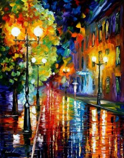 This is the image that I first saw of the artist's work. I was immediately drawn in by the color and vibrancy of it. I've noticed in a lot of his paintings that he paints the sky in a very specific manner. He uses a variety of colors and has obvious brush strokes. He make the sky almost look like confetti.
Source:
http://afremov.com/pages.php?pageid=2
http://static.picassomio.com/images/art/pm-21495-large.jpg
http://37.media.tumblr.com/633846bd759000cd0dff3a5e211121d6/tumblr_mhb7rgIVxg1rqkogmo2_250.jpg
I found this artist a couple years ago and really liked his work and then just recently came across him again. I love the vivid and vibrant color in his work and enjoy that his paintings don't have much inner depth to their meaning and that they are mostly neutral focusing on the aesthetic beauty.
What I like about this work is that the swirling painting mostly in the background makes it seem like the figures have been paused in motion. I feel like the motion aspect give the painted more life to it then just dancers in a pose. I also love the vibrant colors and the realistic tones of the figures.This is the image that I first saw of the artist's work. I was immediately drawn in by the color and vibrancy of it. I've noticed in a lot of his paintings that he paints the sky in a very specific manner. He uses a variety of colors and has obvious brush strokes. He make the sky almost look like confetti.Source:
http://afremov.com/pages.php?pageid=2
http://static.picassomio.com/images/art/pm-21495-large.jpg
http://37.media.tumblr.com/633846bd759000cd0dff3a5e211121d6/tumblr_mhb7rgIVxg1rqkogmo2_250.jpg
Zaria Forman
 Zaria Forman is a landscape artist. Her drawings are done in a large scale with pastel as her material. She started her work at a young age traveling wither her parent. her mother was a photographer who took photo of remote landscapes around the world. Forman has various exhibits around the world.
I like Forman's work because of it's large scale. I feel like it compliment the grand landscapes that she is depicting and doesn't diminish the grandness of the depiction.
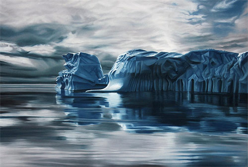 I'm really curious if she works from photographs that she takes or if its all by memory. There is amazing detail in her work which I think is impression mostly by the fact that its done in pastel which in my experience is very hard to render detail in. I like that she chooses things that seem almost untouchable, like they are just to amazing by themselves to touch or alter. I also like the she uses a more muted color scale. I think it would look too cheeky and fake if there were bright colors
Source:
http://www.zariaforman.com/#!about/c10fk
http://www.booooooom.com/wp-content/uploads/2013/12/zaria-forman_09.jpg
https://encrypted-tbn1.gstatic.com/images?q=tbn:ANd9GcRMAlfTIrn2dBoY3YzPhA7iqVEaQnNmWyiGvUuEBOofwGA8vb3c
Edward Degas
Edward Degas is a well known traditional French painter and sculptor. Went to school for literature and began studying law but never finished due to his interest in drawing and painting. He is mostly know for his ballerina paintings that are in a distinct style and in an impressionistic manner.
I love Degas' work. I love that he just paints what he sees and just studies the same thing until his hearts content. I think the style a color in which he paints is very distinctive to him and its easy to pick out his paintings among many.
 This is one of my favorite paints by Degas. I like that it's simple and there is nothing grand or glamorous going on, it's just a dance rehearsal and practice. The windows allow for light which makes the dancers glow in their white dresses. It seems like you are sitting just right there on the dance floor just watching whats going on it does seem to impose on the painting. I also like that there are parts that are cut off in the picture, I feel like it add the illusion of realism in the painting seeing as when we look at things in real life there are often things that are cut off by vision.
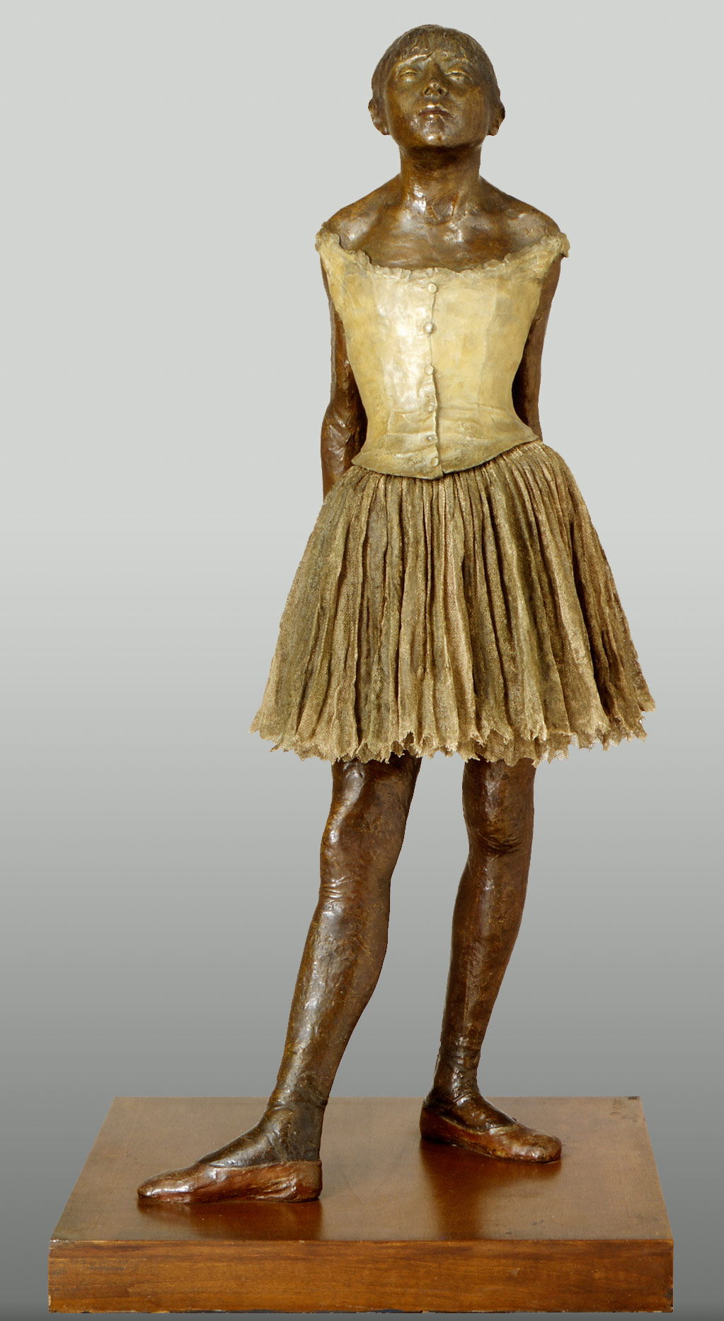 This is one of Degas more well know sculptures. The dress is hand made of fabric and I believe that the sculpture is bronze or some other kind of metal. I'm not fond of the texture of the skin, it looks rough and wrinkling to me. The dancer is obviously a young girl and i think the skin should be smoother than what is portray, though time and it's age might have altered the texture. I do like the contrast between the material of the dress and the metal I feel like it just solidifies the figure as a timeless piece.
Source:
http://www.edgar-degas.org/biography.html
http://4.bp.blogspot.com/_AVg5BeM5Mmc/TCXM656hkcI/AAAAAAAAAQY/vswYyj1n4dA/s320/degas.jpg
http://www.metmuseum.org/toah/images/h2/h2_29.100.370.jpg
I love Degas' work. I love that he just paints what he sees and just studies the same thing until his hearts content. I think the style a color in which he paints is very distinctive to him and its easy to pick out his paintings among many.
 This is one of my favorite paints by Degas. I like that it's simple and there is nothing grand or glamorous going on, it's just a dance rehearsal and practice. The windows allow for light which makes the dancers glow in their white dresses. It seems like you are sitting just right there on the dance floor just watching whats going on it does seem to impose on the painting. I also like that there are parts that are cut off in the picture, I feel like it add the illusion of realism in the painting seeing as when we look at things in real life there are often things that are cut off by vision.This is one of Degas more well know sculptures. The dress is hand made of fabric and I believe that the sculpture is bronze or some other kind of metal. I'm not fond of the texture of the skin, it looks rough and wrinkling to me. The dancer is obviously a young girl and i think the skin should be smoother than what is portray, though time and it's age might have altered the texture. I do like the contrast between the material of the dress and the metal I feel like it just solidifies the figure as a timeless piece.
Source:
http://www.edgar-degas.org/biography.html
http://4.bp.blogspot.com/_AVg5BeM5Mmc/TCXM656hkcI/AAAAAAAAAQY/vswYyj1n4dA/s320/degas.jpg
http://www.metmuseum.org/toah/images/h2/h2_29.100.370.jpg
Eadweard Muybridge
 Eadweard Muybridge was born in the early 1800's. He was a photographer working in a lot of landscape before starting as a war and government photographer. His work was very progressive and ahead of it's time. He also discovered and was the pioneer in motion pictures. With his work in sequencing picture he studied motion of people and animals using multiple photographs and cameras in the process. He would later be acquitted for the murder of his wife's lover who was the true father of his son.
I think his work as whole is very interesting just in the massive amount of photographs that he took. He took a whole book of photographs that were just people moving and doing simple everyday tasks, and that was just one of his books. I'm very impressed by just the dedication that he had to his work.


Source:
http://www.eadweardmuybridge.co.uk/muybridge_image_and_context/introducing_muybridge/
http://photovoltaicpoetry.com.au/wp-content/uploads/2013/09/Eadweard-Muybridge-swinging-pick_wb.jpg
https://encrypted-tbn3.gstatic.com/images?q=tbn:ANd9GcQZ18at7j7G_QbLwCW6gQkQbt5peC0hrgKAJEd_BapKc5mt2RiN
http://media.economist.com/images/images-magazine/2010/10/09/bk/20101009_bkp003.jpg
The Old Idaho Penitentiary
The place is The Old Idaho Penitentiary. The context and purpose for the display is to be educational for the most part. I think its also for entertainment, it's rumored that the penitentiary is haunted so that adds excitement and interest to the place. It's also meant as a historical site that used to be of regular function for holding criminals, but no longer does. They are communicating the old ways of dealing with criminals as well as some history of Idaho that isn't about the Oregon Trail and Native Americans.
There is a lot of old, rusting metal. There are a lot of different colors and oddly decorated areas. There is pealing paint. Lots of small spaces. Not a lot of plant life, mostly just rocks and sand, some weeds and grass, but not much. There are certain rooms with lots of information about specific inmates and certain areas of the prison like the women's prison and where solitary confinement was. Sometimes they give a brief history of the people who were involved the the space. They also keep a record of the deaths that occurred.
My first impression is that it's very intimidating. You feel very closed in in a lot of spaces. There are area that are maintained that are for just reading information, then there are areas that aren't maintained and just preserved how they are and left to change with age. I didn't really want to be loud at all, for the feeling that I might disturb someone, even though there weren't really any people there.
A description of a cell is pealing paint, dirty, full of drawings and graffiti, bunk beds, toilet, shelf, multicolored walls.
I would describe it as eerie. I would say that it looks as old as it is. It's very rusted and peeling. lots of metal and cement. Lots of old photos and information.
Old, dirty, informative, silencing.
There are a lot of descriptions and paragraphs about the rooms that you enter. There are selected stories about certain events and people. The rooms are specified and almost themed.
The objects are all, if not mostly all, artifacts and not artificial.
I think the meaning is just to kind of shed light on some not so great things that happened here. People forget that Idaho hasn't always been as safe as it is now. Things haven't always been the way they are now. I think that the exhibit just displays a little bit of dark history from the area.
I don't think that finances are an issue in the display, it's all historical and maintenance that is really involved with the prison. I think the only real things they had to consider in the display was that they had to include the families of the prisoners in the decision to display these people in the exhibit.
I think the intended audience is definitely not meant for children. The area is meant for those of a more mature audience. I don't think that it's really safe for kids to be in both informatively and physically. I thinks its really just meant for older people who enjoy the history and rumors of it. I think that it's very effective, especially since it wasn't always an exhibit.
Boise Zoo
I went to the Zoo as one of my exhibits. I took the entire zoo as an exhibit rather than using just one specific space. The display is for education and entertainment.
I see lots of wild life in just about every direction both plant life and animals. There are tall linked cages that hold monkeys and birds. Then there are the large in ground exhibits that are mostly barred by wood and concrete to hold bigger animals like the bears and giraffes. There are smaller cages made of either glass or more linked metal hold the smaller animals like the red panda. There are also an exhibit for mere cats where there is class and concrete and a lot of sand. There are also buildings in which have nonliving and small animals that are kept indoors and are a part of a more themed atmosphere.
My first impression of the exhibit is that it's been around a long time. Nothing really looks new, as I know that it's not. I like that there is a lot of greenery and trees that provide shade.
It's old, informative, varied, green, brown, lots of pathways, a pond, lots of metal cages.
It's obvious that it has display/museum qualities. There is a pane with information at just about every turn and and direction. They are on the cages of the animal or off to the side of them. There are displays next to plants that are by themselves as well as in the exhibits. There are also people placed around the zoo who are maintaining the animals and area, who also inform you about the zoo.
I don't really know if there is a point of view for the creator of this exhibit aside from easily navigated and informative.
I think that the meaning that is meant to be conveyed is that the creator wanted the zoo to be enjoy and educational. I think that they want people who live and visit here to be able to enjoy and easily go through the zoo in an environment that is safe.
There is a natural element to the zoo, lots of plants and animals. Lots of signs that direct you and inform you. Aside from maybe repetition, I don't see many formal elements included in the exhibits.
I think most of the decisions were based on money and location. Things like if they can house certain animals and can they afford to maintain and keep them alive and happy. They also had to think that children and schools and families would be there main guests and that it needs to be easy to navigate.
The intended audience is basically just animal lovers, children, and family. I think it's effective in being educational and entertaining. I wish there was more to look at but I don't think that funding an environmental aspects allow for much
Anne Frank Memorial
1. The space includes crescent shaped displays and seat that are either filled with information about the Holocaust and Anne Frank or naming donors and people involved with creating the memorial. It's right off of the street and the greenbelt near a bridge that enters right into the memorial. There is a pod area that has small waterfalls.
2. There is a somewhat life size statue of Anne Frank in a window that is surrounded by stone benches. There are photos along crescent stone walls. There is also paragraphs upon paragraphs on information on the walls. There are a couple voice boxes that when cranked emit a voice that tells information as well.
3. The color of the memorial are definitely dominant. There are mostly neutral colors. Aside from the plant life in the area there really isn't any color aside from brown, white, cream, and bronze. There is a balance and asymmetry to the memorial with representation and stone walls and benches in multiple areas, making the area not so overwhelmed in one space.
4.This memorial is site specific. It's very intentional as to the location. It's right off of the road where everyone can see it. It's also along the greenbelt where people can see it as they are riding along the pathway. I feel like its placed so that it is easy to access.
5.
6. Stone and concrete were used in creating mostly of the memorial. There is also some metal material in the statue and plaques.
7.The text functions as informative above everything else.
8.I think that the intended function is to inform and to be sure that even in a place so far away and so disconnected from the event, we can still remember and learn about the events that occurred. I also feel like it's educational, I know that a lot of schools go to the memorial when they learn about the Holocaust.
9. I feel like it's successful as an educational memorial. As an art piece I don't think that it's successful only because of the boring aesthetic quality. I don't really think it was really intended as an art piece just on its own, so I think as an educational memorial it's successful.
Monday, May 5, 2014
Janne Parviainen
Janne Parvianinen is a mixed media artist. His man media is photography, and he paints with light paint as well as oil painted scenes and figures in a 3D format.


 I feel like all of the work is similar enough that I can talk about it as a one instead of individually. I feel like I would see something like this at a rave show or concert. I love the intricacies in the light paintings and that it's basically just line work. I feel like if there was an attempt to put anymore detail then that it would have made the figures too cartoon-like and it would make the piece really uninteresting.
I like his work because I feel like it's such a contemporary things, but unlike normal contemporary art. I feel like it plays on the scene that a lot of social events have come to and what people enjoy now. I like that this art isn't a weird and awkward type of contemporary art, but a real socially aware art.
I feel like all of the work is similar enough that I can talk about it as a one instead of individually. I feel like I would see something like this at a rave show or concert. I love the intricacies in the light paintings and that it's basically just line work. I feel like if there was an attempt to put anymore detail then that it would have made the figures too cartoon-like and it would make the piece really uninteresting.
Source:
Wim Delvoye
Wim Delvoye is a Belgian artist who works in a wide variety of media. His materials are generally non traditional. He is considered to be a neo-conceptual artist. He often works with materials that tend to clash and disagree with each other in a conceptual way. He's done some very controversial work that has gotten a lot of attention.
I like some of Delvoye's work, though not all of it. I feel like some of it is a little too over the top and it just makes me feel concerned. He's done pieces where he has tattooed a live pig. I don't really like that just because I don't think that would be right to do to an animal. The actual tattoos are really nicely done, but doing it on pig is a little much. Some of his other pieces have a nice architectural quality that I really enjoy.
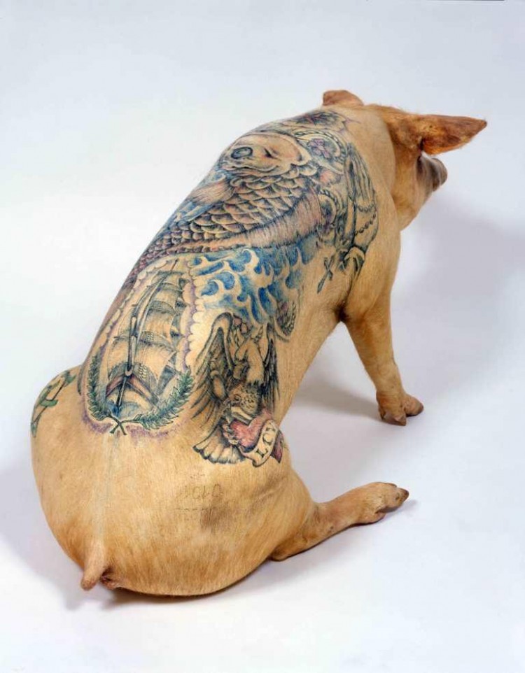
This is the piece with the pig tattoos. Like I said, I think the tattoos are really beautiful and well done, but the pig is detracting from the aesthetics of the piece.
 This is the piece that I first saw of Delvoye's work, before all of this pig business. I like the intricate patterns and detail and craftsmanship of this piece. I feel like it such an unusual thing to do to a tire. I like the fact that the pattern and the tire don't go together at all.
Source:
http://en.wikipedia.org/wiki/Wim_Delvoye
http://designyoutrust.com/wp-content/uploads/2012/02/w1-750x962.jpg
http://www.happy-pixels.com/wp-content/uploads/2012/10/wim-delvoye-02.jpg
I like some of Delvoye's work, though not all of it. I feel like some of it is a little too over the top and it just makes me feel concerned. He's done pieces where he has tattooed a live pig. I don't really like that just because I don't think that would be right to do to an animal. The actual tattoos are really nicely done, but doing it on pig is a little much. Some of his other pieces have a nice architectural quality that I really enjoy.
This is the piece with the pig tattoos. Like I said, I think the tattoos are really beautiful and well done, but the pig is detracting from the aesthetics of the piece.
This is the piece that I first saw of Delvoye's work, before all of this pig business. I like the intricate patterns and detail and craftsmanship of this piece. I feel like it such an unusual thing to do to a tire. I like the fact that the pattern and the tire don't go together at all.Source:
http://en.wikipedia.org/wiki/Wim_Delvoye
http://designyoutrust.com/wp-content/uploads/2012/02/w1-750x962.jpg
http://www.happy-pixels.com/wp-content/uploads/2012/10/wim-delvoye-02.jpg
Daniel Firman
Daniel Firman is a sculptor and installation artist. I couldn't find any background information on him that was in English. He works a lot with altering figures and has a very contemporary style in which he makes his work.
 This is one of his more well known sculptures. He's either had it in multiple places or he has multiple elephants that he has made. He has the elephant holding on by it's trunk in different positions like upside down and sideways. I like this piece mostly because I find it pretty humorous. I also like that he's had it in multiple positions. I feel like it looks really realistic which makes it more interesting. I feel like if it was in unrealistic colors it wouldn't be as interesting, it would almost seem to expected.
 Firman has multiple sculptures like this where he has a mass of things on the figure of a person. I like the fact that he mostly make the figures in a monotone color base. I feel like it would look to busy and confusing if it was in multiple or realistic colors. I feel like it adds interesting and makes you want to look more into the figure and makes you want to look at all of what is included in the piece.
Source:
http://beautifuldecay.com/wp-content/uploads/2011/04/black-hole.jpg
This is one of his more well known sculptures. He's either had it in multiple places or he has multiple elephants that he has made. He has the elephant holding on by it's trunk in different positions like upside down and sideways. I like this piece mostly because I find it pretty humorous. I also like that he's had it in multiple positions. I feel like it looks really realistic which makes it more interesting. I feel like if it was in unrealistic colors it wouldn't be as interesting, it would almost seem to expected.Firman has multiple sculptures like this where he has a mass of things on the figure of a person. I like the fact that he mostly make the figures in a monotone color base. I feel like it would look to busy and confusing if it was in multiple or realistic colors. I feel like it adds interesting and makes you want to look more into the figure and makes you want to look at all of what is included in the piece.Source:
http://beautifuldecay.com/wp-content/uploads/2011/04/black-hole.jpg
Cornelia Konrads
Conrelia Konrad is a freelance artist and sculptor. She didn't start as a sculptor, she studied philosophy, as well as the German language and culture. She used her knowledge and studies and found her way into the world of art and sculpture.
Konrad works with lot of book art. She uses a lot of her German influence in her book work. Her main work centers around her on site sculptures. She does a lot of stone structure that have a dream like quality to them.
 These are one of her site specific sculptures. The structures seem to float away from themselves into the sky seeming like they will never stop floating. I'm curious if she created the entire structure or if she found an existing structure and altered it to act in this way. I think the site in which that it is placed is very well with the pathway and the trees.
 This is one of her book art pieces. I can't exactly tell how the book is altered. It looks like it's spiked out so that they are prickled paper structures on the surface of the paper. I like this piece, I feel like it sends a messaged of the danger of knowledge at times, or at least that's what I get from it.
Source:
http://www.cokonrads.de/about/about.html
http://media-cache-cd0.pinimg.com/236x/95/a7/f7/95a7f751372c4e47ce088ebc6d8a3390.jpg
Konrad works with lot of book art. She uses a lot of her German influence in her book work. Her main work centers around her on site sculptures. She does a lot of stone structure that have a dream like quality to them.
These are one of her site specific sculptures. The structures seem to float away from themselves into the sky seeming like they will never stop floating. I'm curious if she created the entire structure or if she found an existing structure and altered it to act in this way. I think the site in which that it is placed is very well with the pathway and the trees.This is one of her book art pieces. I can't exactly tell how the book is altered. It looks like it's spiked out so that they are prickled paper structures on the surface of the paper. I like this piece, I feel like it sends a messaged of the danger of knowledge at times, or at least that's what I get from it.Source:
http://www.cokonrads.de/about/about.html
http://media-cache-cd0.pinimg.com/236x/95/a7/f7/95a7f751372c4e47ce088ebc6d8a3390.jpg
Subscribe to:
Posts (Atom)