Tuesday, May 6, 2014
Muybridge Artist Statement
In this project I really wanted to stay true to the images that I saw of Eadweard Muybridges work. I wanted to do a sequence of images that depict movement. I wanted to take a more contemporary approach to the work and choose a different subject matter that would have a more interesting movement. I decided that I would show the movement of two liquids interacting together. I started with a large pitcher of water. I mixed food coloring and milk together and slowly dripped the mixture into the water. I took black and white photos of the process and posted them together in sequence. I wanted the pictures to be in black and white so that the color wouldn't be any sort of focus and that the movement would shine through in the photos.
Joseph Vassie
Joseph Vassie is a artist working various areas of drawing and painting. I couldn't find much information about his background and lifestyle.
I like specifically his circular pen drawings. He has portraits and body parts in which he depicts in a pen drawing.

 Most of the work of his that I liked was all pretty similar and I'm guessig part of the same series. I like that he draws such a simple subject matter in a very intricate and interesting way. it seems almost careless in the way that it looks but I'm guessing its all very intentional and precise in its creation. I also like that he didn't use much color and just brown and black. I feel like its complex enough that color would detract from the delicate lines.

Source:
http://cdnpix.com/show/imgs/93fb50e91ef8e39eae25e5452d19502d.jpg
http://d3oeu2l8qd7s1b.cloudfront.net/311259/art/461584/247220-7.jpg
I like specifically his circular pen drawings. He has portraits and body parts in which he depicts in a pen drawing.
Most of the work of his that I liked was all pretty similar and I'm guessig part of the same series. I like that he draws such a simple subject matter in a very intricate and interesting way. it seems almost careless in the way that it looks but I'm guessing its all very intentional and precise in its creation. I also like that he didn't use much color and just brown and black. I feel like its complex enough that color would detract from the delicate lines.Source:
http://cdnpix.com/show/imgs/93fb50e91ef8e39eae25e5452d19502d.jpg
http://d3oeu2l8qd7s1b.cloudfront.net/311259/art/461584/247220-7.jpg
Kwangho Shin
Kwangho Shin is a drawer and painter based out of Seoul. He studied at Keimyung University. His work is mostly distorted portraiture. His main tools are charcoal and oil paint.
as I've written before, I really enjoy portraits. I like these in particular because of their distortion. I feel like each of the paintings has their own individual feeling to them in the way that they are distorted.
 Most of the work of his that I've seen has a lot of color in it. I like that this one is different and is in a more monotone color scale. I like that they details in the face aren't too distorted. It's mostly the outer edges that have gained the big distortions. Its also nice how the highlights and shadows are in their proper place on the face despite the distortion.
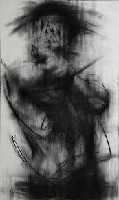 This is the drawing in which I first noticed the artist. When i first looked at it I couldn't tell that it was a person. Then after realizing it was a person, I couldn't tell what they were doing. Now after distinguishing the hands I understand the figure. I like that the gesture is complimented by the black smears, it almost mimics the action of the figure.
Source:
http://en.wikipedia.org/wiki/Shin_Kwangho
https://d1ycxz9plii3tb.cloudfront.net/additional_images/5321f08dcb4c278738000040/medium.jpg
https://encrypted-tbn1.gstatic.com/images?q=tbn:ANd9GcSzVCzJni-Q69_uKfCxVlk2nSle2eKUOxsKdANF5QUQS1i05EgpEg
as I've written before, I really enjoy portraits. I like these in particular because of their distortion. I feel like each of the paintings has their own individual feeling to them in the way that they are distorted.
Most of the work of his that I've seen has a lot of color in it. I like that this one is different and is in a more monotone color scale. I like that they details in the face aren't too distorted. It's mostly the outer edges that have gained the big distortions. Its also nice how the highlights and shadows are in their proper place on the face despite the distortion.Source:
http://en.wikipedia.org/wiki/Shin_Kwangho
https://d1ycxz9plii3tb.cloudfront.net/additional_images/5321f08dcb4c278738000040/medium.jpg
https://encrypted-tbn1.gstatic.com/images?q=tbn:ANd9GcSzVCzJni-Q69_uKfCxVlk2nSle2eKUOxsKdANF5QUQS1i05EgpEg
Maurice Sapiro
Maurice Sapiro is New Jersey born artist based out of Connecticut. He is an oil painter mainly focusing on still life, landscape, and dreamlike landscapes. He's published books and won various awards for his work.
I like his work because it feels very traditional and calm to me. There is just a very airy feel to the paintings and reminds me of the older traditional styles of painting that I've learned about since beginning my art studies. I feel like traditional painting styles like this are going out of style and are being replace by a more modern and contemporary way of painting.
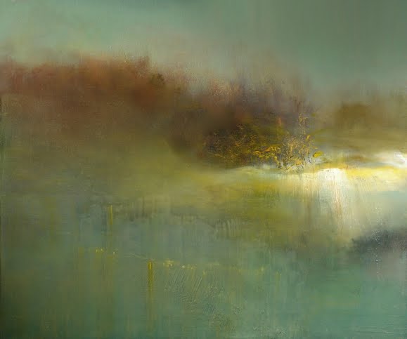 I love the use of color and texture in the painting. I feel like the balance is really nice with the heave light on one side and the various colors and drippings on the other. I'm curious as to how he got that look and texture to the clouds and sky. I think the use of yellow throughout the sky is also very effective.
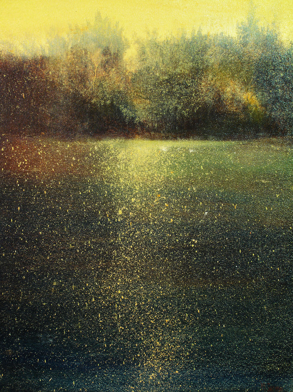 What I like most about this is the speckles throughout the dark areas of the piece. I'm' curious if he used a splatter method to do that or some other way of doing that other than by hand . I like the piece as a whole, but the area at the top by the yellow sky I don't like as much. I feel like it looks translucent against that background or maybe in just how it was painted. I just feel like its almost disconnected or unfinished in comparison to the rest of the painting.
Source:
http://mauricesapiro.com/bio/
https://d30dcznuokq8w8.cloudfront.net/thumbnails/w/580/h/483/q/85/product/5/3/d8839991c210ca55f5488f8fa7747f.jpg
http://www.slowartday.com/wordpress/wp-content/uploads/2013/02/1.jpg
I like his work because it feels very traditional and calm to me. There is just a very airy feel to the paintings and reminds me of the older traditional styles of painting that I've learned about since beginning my art studies. I feel like traditional painting styles like this are going out of style and are being replace by a more modern and contemporary way of painting.
I love the use of color and texture in the painting. I feel like the balance is really nice with the heave light on one side and the various colors and drippings on the other. I'm curious as to how he got that look and texture to the clouds and sky. I think the use of yellow throughout the sky is also very effective.What I like most about this is the speckles throughout the dark areas of the piece. I'm' curious if he used a splatter method to do that or some other way of doing that other than by hand . I like the piece as a whole, but the area at the top by the yellow sky I don't like as much. I feel like it looks translucent against that background or maybe in just how it was painted. I just feel like its almost disconnected or unfinished in comparison to the rest of the painting.Source:
http://mauricesapiro.com/bio/
https://d30dcznuokq8w8.cloudfront.net/thumbnails/w/580/h/483/q/85/product/5/3/d8839991c210ca55f5488f8fa7747f.jpg
http://www.slowartday.com/wordpress/wp-content/uploads/2013/02/1.jpg
Alexandre Farto (Vhils)
Alexandre Farto (also know as Vhils) is a Portuguese street artist. He studied at the University of Arts in London. Growing up in Portugal, wars in Portugal were going on and they later effect and influenced his work. He was first noticed and compared to street artist Banksy, and was soon after published and offered space for his work.
I like that his street art is more individual than a lot that I've sen before and it steps away from painting. Vhils style is based on carving a relief from and existing structure by digging and drilling through layers of walls. I also like that his work is both in the streets for the world to see as well as in galleries. I feel like it steps outside of borderline vandalism into art.
 Another things I really like about Vhils is that he doesn't need to use a lot of color and extreme contrast to make his work noticeable and beautiful. Its impressive that he finds so much detail when carving and drilling into the walls. I'm curious if he's run into problems with the walls and materials he uses, like the wall breaking apart more than he expected or if he has a knowledge of which walls he will be able to use or not.
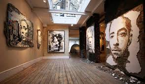 These are pieces that are shown a gallery space. It looks like he might have taken that chunk of wall and just put it up in the gallery, which I think is pretty cool in itself. It's interesting how there are chunks of wall, plaster, and rubble on the floor beneath a lot of the works. I like that it almost puts itself in it's own world by having the rubble below.
Source:
http://www.streetartbio.com/#!vhils/ci1d
https://encrypted-tbn0.gstatic.com/images?q=tbn:ANd9GcTUvHkGRSEkVj6e9V3smIhsAHPHqyExev-5SRyLqvaj2UJm4-vI
https://encrypted-tbn1.gstatic.com/images?q=tbn:ANd9GcTSmwhU2nZZwzzVuSiWi2XxGOFnmfgLhuuRmPggJi0cRh9RFJHFzQ
I like that his street art is more individual than a lot that I've sen before and it steps away from painting. Vhils style is based on carving a relief from and existing structure by digging and drilling through layers of walls. I also like that his work is both in the streets for the world to see as well as in galleries. I feel like it steps outside of borderline vandalism into art.
Source:
http://www.streetartbio.com/#!vhils/ci1d
https://encrypted-tbn0.gstatic.com/images?q=tbn:ANd9GcTUvHkGRSEkVj6e9V3smIhsAHPHqyExev-5SRyLqvaj2UJm4-vI
https://encrypted-tbn1.gstatic.com/images?q=tbn:ANd9GcTSmwhU2nZZwzzVuSiWi2XxGOFnmfgLhuuRmPggJi0cRh9RFJHFzQ
Leonid Afremov
Leonid Afremov is a Russian-Isreali painter. His paintings are done in exaggerated colors in an impressionistic style. His weapon of choice is oil paint on canvas. He displays his work mostly though online media, not really doing displays or exhibits in public or social settings.
I found this artist a couple years ago and really liked his work and then just recently came across him again. I love the vivid and vibrant color in his work and enjoy that his paintings don't have much inner depth to their meaning and that they are mostly neutral focusing on the aesthetic beauty.
 What I like about this work is that the swirling painting mostly in the background makes it seem like the figures have been paused in motion. I feel like the motion aspect give the painted more life to it then just dancers in a pose. I also love the vibrant colors and the realistic tones of the figures.
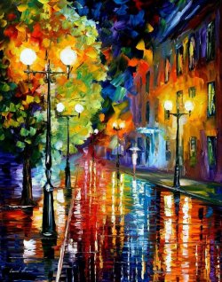 This is the image that I first saw of the artist's work. I was immediately drawn in by the color and vibrancy of it. I've noticed in a lot of his paintings that he paints the sky in a very specific manner. He uses a variety of colors and has obvious brush strokes. He make the sky almost look like confetti.
Source:
http://afremov.com/pages.php?pageid=2
http://static.picassomio.com/images/art/pm-21495-large.jpg
http://37.media.tumblr.com/633846bd759000cd0dff3a5e211121d6/tumblr_mhb7rgIVxg1rqkogmo2_250.jpg
I found this artist a couple years ago and really liked his work and then just recently came across him again. I love the vivid and vibrant color in his work and enjoy that his paintings don't have much inner depth to their meaning and that they are mostly neutral focusing on the aesthetic beauty.
What I like about this work is that the swirling painting mostly in the background makes it seem like the figures have been paused in motion. I feel like the motion aspect give the painted more life to it then just dancers in a pose. I also love the vibrant colors and the realistic tones of the figures.This is the image that I first saw of the artist's work. I was immediately drawn in by the color and vibrancy of it. I've noticed in a lot of his paintings that he paints the sky in a very specific manner. He uses a variety of colors and has obvious brush strokes. He make the sky almost look like confetti.Source:
http://afremov.com/pages.php?pageid=2
http://static.picassomio.com/images/art/pm-21495-large.jpg
http://37.media.tumblr.com/633846bd759000cd0dff3a5e211121d6/tumblr_mhb7rgIVxg1rqkogmo2_250.jpg
Zaria Forman
 Zaria Forman is a landscape artist. Her drawings are done in a large scale with pastel as her material. She started her work at a young age traveling wither her parent. her mother was a photographer who took photo of remote landscapes around the world. Forman has various exhibits around the world.
I like Forman's work because of it's large scale. I feel like it compliment the grand landscapes that she is depicting and doesn't diminish the grandness of the depiction.
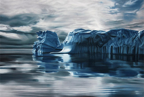 I'm really curious if she works from photographs that she takes or if its all by memory. There is amazing detail in her work which I think is impression mostly by the fact that its done in pastel which in my experience is very hard to render detail in. I like that she chooses things that seem almost untouchable, like they are just to amazing by themselves to touch or alter. I also like the she uses a more muted color scale. I think it would look too cheeky and fake if there were bright colors
Source:
http://www.zariaforman.com/#!about/c10fk
http://www.booooooom.com/wp-content/uploads/2013/12/zaria-forman_09.jpg
https://encrypted-tbn1.gstatic.com/images?q=tbn:ANd9GcRMAlfTIrn2dBoY3YzPhA7iqVEaQnNmWyiGvUuEBOofwGA8vb3c
Subscribe to:
Posts (Atom)